Planning

I'm no expert in still life, I find it's the hardest genre for me personally. I can't stage / set the items up without stepping back and thinking...that looks sh1te. Now to me you've done a good job here and my only criticism (and take it with a pinch of salt as I know naff all) is the left side looks a little bare / empty.
 
I'm no expert in still life, I find it's the hardest genre for me personally. I can't stage / set the items up without stepping back and thinking...that looks sh1te. Now to me you've done a good job here and my only criticism (and take it with a pinch of salt as I know naff all) is the left side looks a little bare / empty.
Thank you, Adam, I find this very difficult, cheers for the feedback, I wanted the flowers on the right as we read left to right, but then being right handed the mug was also on the right, but I can see what you mean, I need to explore this style more. (y)
 
The second one for me too Gav.
 
Well, I'm not going to help you, because I prefer the first. I can't really pin down quite why. Perhaps it is that the second looks more staged, to me. But what do I know?
 
Well, I'm not going to help you, because I prefer the first. I can't really pin down quite why. Perhaps it is that the second looks more staged, to me. But what do I know?
I had the same feeling looking through the images, I think that's why I picked that one to work & post first.

Thank you for the feedback (y)
 
The first has nice geometry but looks like a set up still life. The second looks less unreal and so sits in the mind more comfortably.

It's very difficult to make a contrived scene believable.
 
The first has nice geometry but looks like a set up still life. The second looks less unreal and so sits in the mind more comfortably.
It's very difficult to make a contrived scene believable.

Thank you for the feedback, Toni, I may need to try a leaving something set up for a while and 'use' the space so it could becomes more natural.

Lots to think about... but real for me would be a mess, tea rings from mugs etc.. :D
 
Pinging our resident still life expert @TheBigYin but for me its the second because of the story. Both are well lit with good details, I'm a bit unsure about the split background as I find my eye bouncing between the two halves of the image.
 
Last edited:
Pining our resident still life expert @TheBigYin but for me its the second because of the story. Both are well lit with good details, I'm a bit unsure about the split background as I find my eye bouncing between the two halves of the image.
Thank you, Chris, I added the extra fabric for texture but fear I've taken the wrong route, I have a few on plain BG, I'll see if there are any that worked out.
Thanks for the feedback.
 
Lots to think about... but real for me would be a mess, tea rings from mugs etc.. :D

The real secret to "anchoring" that mug in reality is being able to see the tea/coffee in the mug...

I'll come back and give a bit more crit on them both later, got to go earn my daily pittance right now...
 
The real secret to "anchoring" that mug in reality is being able to see the tea/coffee in the mug...
I'll admit I thought it looked a bit sterile, if that's the right term.
I'll come back and give a bit more crit on them both later, got to go earn my daily pittance right now...
Thank you, Mark, ask @sirch for a payrise as he dropped you in it :LOL: :exit:
 
Thank you, Chris, I added the extra fabric for texture but fear I've taken the wrong route, I have a few on plain BG, I'll see if there are any that worked out.
Thanks for the feedback.
I think some texture all the way across would be good, its just the split that I find a tad distracting but I don't think anyone else has mentioned it so it is probably me.
 
I think some texture all the way across would be good, its just the split that I find a tad distracting but I don't think anyone else has mentioned it so it is probably me.
Em did last night (y)
Thank you.
 
Hi all

Having another go at still life, happy to take crit' as always.

Thank you for looking.


Untitled by Gavin Wickham, on Flickr
okay, i'll try and give my 2 penn'orth - i've not really read much of anything anyone else has said so apologies if i'm repeating stuff already given.

First of all, I Think it's a nice clean approach - like the "single light" (ok, digguse light source, window or however it was done) - but no obvious faffing and adding back with secondary light sources - maybe judicious use of reflectors here and there - but nothing whatsoever in the lighting that looks "wrong" - while ensuring everything is actually quite high key save the backgroound.

It passes my first "still life" rule as well - there's nothing on the table that's not there to further the story.

As I've already hinted, personally, I'd have liked the cup to have just some clue that it was really there for a reason - making it an "active" part of the picture and story telling by having something... could be anything - could be a teaspoon on the table with tea/coffee marks on it - could be a ring on the table, but my personal fave is the simple "see the tea in the mug"...

while we're on the table - like the choice of white/off-white - but as it stands, it's hard to tell if its white melamine on a cafe table, a VERY well pressed white tablecloth, or (what my mind as a photographer jumps to) just a white paper sheet on a darker table... Ideally, i'd be saying white linen tablecloth - and the giveaway is going to be a woven texture on the white background. Not easy to fake well - easier to actually get the tablecloth and the iron out IMO.

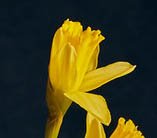
I like the small vase, and the general arrangement of the Daffs - though i'd have been tempted to have physically rotated one of them in the jar so it was more like this...
daf1.jpg

as that way it wouldn't have cut over the lower bloom, and would have perhaps filled some of the black space between the flower heads.

now, we come to what is in parts my favourite bit of the image... the book and glasses.

Now, I think that it's to me the most marvellous bit of story-telling and something I'm slightly jealous i never thought of...

Whenever I think of Daffs, as a lover of the Lake District, there's always the Wordsworth poem going through my head...

so, what better to use as a visual prop than Wainwrights guide to the Fells - and I can see why you Chose the North Western Fells - for the Yellow Cover details.

Shame of course that the area around Grasmere where the poem was written is in the Central Fells book, but I can see why you'd probably not want the Blue Cover...

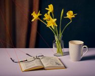
the one thing I would like to have seen experimented with is actually rotating the book so that the edges of the cover make leading lines that lead into and toward the flowers and not away, out of frame...
leading lines.jpg

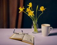
please excuse the absolutely terrible 2 minute photoshop book moving - i'm no digital artist, but just wanted to illustrate what I meant - try not to be put off by the image below - just give it a look with the real props (i'd have shot it myself to show what I meant, but my camera battery is flatter than my singing voice...
rotated book.jpg
I know, perspective's all wrong and so forth, jsut wanted to illustrate the page edges running INTO the picture not out...

sorry if this all seems very negative - it's really, really not - this is probably one of the most enjoyable still life images i've seen on here in years - but I spent best part of a year going down a rabbit-warren on this sort of stuff - I used to take hours / days - occasionally WEEKS over compositions and come out with maybe 10 frames taken... The joy of Still Life is - it's Still - it's not going anywhere, so you CAN take your time - it's not Cartier-Bresson's "Decisive Moment" - its quite the opposite. I used to compose most of my stuff with liveview on the camera and the camera display showing on a 32" TV - i'd be sat in front of the camera, by the props, moving things half a MM one way or the other, or rotating things by a couple of degrees till I was happy. It's the Perfect kind of photography for a OCD Control Freak like me.

Right after a couple of hours of staring at this image - I think I've said all I can for now... I'll have a look at the second shot tomorrow if thats OK...
 
Thank you, Mark, ask @sirch for a payrise as he dropped you in it :LOL: :exit:
it was the Dayjob I had to go suffer through... got to keep a roof over my head somehow.

and to be honest - far from "dropping me in it" - i'd like to thank @sirch for bringing this thread to my attention - it's really been an enjoyable couple of hours really having a good look and thinking about the shot. Reminded me why I don't give as much critique as I'd like to though - I sometimes think it's easier to take the photo than critique it...
 
@TheBigYin Thank you, that is above and beyond the call of duty, thank you!!

Lighting was the use of a soft box. I will try again with the mug being full, may be even adding spoon or tea ring. I agree the cloth is too smooth, it's a cloth I pulled tight over a work horse bench.
Thank you for pointing out the Daffs, I would have never looked at them overlapping.
Good point on the leading lines too, makes perfect sense and thank for taking the time for the edit.

I'll have a look at the second shot tomorrow if thats OK...
Please don't go out of your way to do anymore, I appreciate everything you've said already.

I will try and have another go before the Daff season is finished, I've not had a holiday in 5 years, flicking through those books keeps the dream alive :)

Thank you again, really appreciate the effort, time and detail you've given (y)
 
Last edited:
the one thing I would like to have seen experimented with is actually rotating the book so that the edges of the cover make leading lines that lead into and toward the flowers and not away, out of frame...
That is a real gem of a piece advice and something I'd not ever thought of or heard from others, thanks
 
Last edited:
That is a real gem of a piece advice and something I'd not ever thought of or heard from others, thanks
not really something i got from photography - just old, partly remembered stuff from "art appreciation" lessons back when I was doing my A-Levels - to get through general studies A level, all the "maths and sciences" stream bods were given exposure to the arts / music / literature in the form of gentle intro lessons - I just remember sitting in the Art room, with a big book on composition that was deconstructing perspectives in classic paintings, sculpture and so forth... Big part of it was considering leading lines and how one object can be used to point or direct the gaze to another area of the image - I know - it's sometimes a "swearword" to use the word ART in relation to photography by certain circles who consider photo's as being purely craft - but for me, purely on a personal level - I lack the words to express WHY something is art due to lack of education on that side of things, but I KNOW it when I see it in an image - its the difference between the 99 soul-less sterile perfectly exposed shots, and the one that just makes me stop and think.
 
The real secret to "anchoring" that mug in reality is being able to see the tea/coffee in the mug...

I'll come back and give a bit more crit on them both later, got to go earn my daily pittance right now...
Agreed, and also some water for the flowers, but overall a very good effort with a challenging subject.
I especially like the optical distortion (flower container and reading glasses) which, for some reason, reminds me of Stephen Maturin.
 
Agreed, and also some water for the flowers, but overall a very good effort with a challenging subject.
I especially like the optical distortion (flower container and reading glasses) which, for some reason, reminds me of Stephen Maturin.
Thank you for the feedback Garry, it's interesting you mention water in the vase, I had some crit on another image where I had used water and it was mentioned it was a distraction.

I need to pull my finger out for another go with the feedback in mind.
 
Thank you for the feedback Garry, it's interesting you mention water in the vase, I had some crit on another image where I had used water and it was mentioned it was a distraction.

I need to pull my finger out for another go with the feedback in mind.
My view, FWIW, is that the glass needs to have water simply because cut flowers are always placed in water, and of course, the optical distortion caused by the water would add to the distortion created by the reading glasses - but other views are just as valid as mine.

I think that the coffee mug is a slightly more difficult decision. It must have coffee to justify its inclusion in the shot, but the coffee needs to be very fresh, probably with a hint of steam, and a light skimming it to show the steam, so needs to be the very last part to be added. My own (lazy) approach to this might be to substitute a glass of water, far easier and again adding optical distortion . . .
Thank you, Garry, notes taken (y)
 
Back
Top