You are using an out of date browser. It may not display this or other websites correctly.
You should upgrade or use an alternative browser.
You should upgrade or use an alternative browser.
weekly Bebop's 52 2021 - Week 52: Showcase
- Thread starter Bebop
- Start date
- Messages
- 4,160
- Name
- Kell
- Edit My Images
- Yes
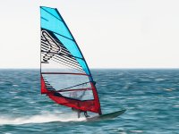
I was just thinking the same thing. Last time I tried it, my shutter speed was still too high and froze the action. When I slowed it down, everything was blurred. In the end I cheated and added the blur in Photoshop.A very effective bit of panning.
Great technique - and a lovely image to boot.
- Messages
- 7,248
- Edit My Images
- No
A very effective bit of panning.
Thank you both. The in body stabilisation of my little Olympus really helps with the panning, though I do have plenty of shots that go in the binI was just thinking the same thing. Last time I tried it, my shutter speed was still too high and froze the action. When I slowed it down, everything was blurred. In the end I cheated and added the blur in Photoshop.
Great technique - and a lovely image to boot.
- Messages
- 4,160
- Name
- Kell
- Edit My Images
- Yes
Ah yeah, now you mention it, completely forgot to do that last time.Thank you both. The in body stabilisation of my little Olympus really helps with the panning, though I do have plenty of shots that go in the binyou do have to make sure the stabilisation is not working in all directions - that caught me out at first.
The stabilisation on some of my lenses is counter intuitive too. Setting one is two-way stabilisation and setting two is just one-way.
Scots_quine
In memoriam
- Messages
- 1,753
- Name
- Joan
- Edit My Images
- Yes
Great shot. Very effective panning.
- Messages
- 7,248
- Edit My Images
- No
Yes my Canon lenses are like that.Ah yeah, now you mention it, completely forgot to do that last time.
The stabilisation on some of my lenses is counter intuitive too. Setting one is two-way stabilisation and setting two is just one-way.
That’s a lovely clean shot, and excellent technique with the pannimg as those above have said. Great photo!
Nicely caught!
thank you all kindlyGreat shot. Very effective panning.
- Messages
- 146
- Name
- Jan
- Edit My Images
- No
Really great action shot, interesting re the stabilisation on the Olympus, I will have to make sure I adjust mine when doing anything similar!Thank you both. The in body stabilisation of my little Olympus really helps with the panning, though I do have plenty of shots that go in the binyou do have to make sure the stabilisation is not working in all directions - that caught me out at first.
- Messages
- 7,248
- Edit My Images
- No
Yes you can either choose the direction, or leave it on auto and it will probably work - I think it was on auto this time. The first time I left it set to all directions and it did an amazing job which thwarted my panning attempts,Really great action shot, interesting re the stabilisation on the Olympus, I will have to make sure I adjust mine when doing anything similar!
Thank you!The sea looks like its been painted, very good panning
- Messages
- 1,407
- Edit My Images
- No
Good panning skills there, not an easy shot I'm sure. Got a good sense of action and speed in the picture!
- Messages
- 7,248
- Edit My Images
- No
Thanks SimonGood panning skills there, not an easy shot I'm sure. Got a good sense of action and speed in the picture!
- Messages
- 7,248
- Edit My Images
- No
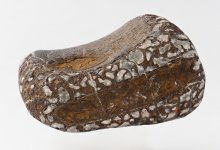
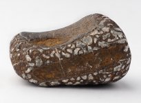
Week 46: Back (bone) - fossilised vertebra of a theropod
A fossil my husband found on our local beach.
I'm seriously interested in critique this week as I have been promising to try a stacked image of a fossil using studio lights to help a friend out. This theme was the perfect excuse to finally try it out. This was a jpeg produced by in camera stacking of 15 images.
Taken on a white background resting on a nightlight casing - one studio light and reflector. He will need to cut the images out to present them, so whilst a shadow might be nice from the photographic point of view, it is not what he wants.
Edit: I realise my background is not uniformly white - but I'm thinking he will probably still want to cut it out, so perhaps this doesn't matter.

Last edited:
- Messages
- 7,248
- Edit My Images
- No
Thanks Simon. I'm very much a beginner at this sort of thingNicely done.
I'm pretty certain I haven’t got enough knowledge to critique sensibly, but nevertheless it looks good to me. Good focus across the image and good colour balance.
well done.
- Messages
- 7,248
- Edit My Images
- No
Thank youLooks sharp front to back, side to side, up to down to me, great job (but i'm no expert), nice fit for the theme too.
- Messages
- 1,407
- Edit My Images
- No
Didn’t realise it was an image made from 15 shots. You’ve obviously put a lot of work into. I’m no expert on things like that but it’s come out really well and the detailing is great. 
- Messages
- 458
- Name
- Catherine
- Edit My Images
- Yes
Lovely sharp image and well lit. I think it might have been useful to have a slight shadow underneath to ground it, as it seems to be floating. It really depends on what the purpose of the image is for, it appears to be what you were after, so well done.
Last edited:
- Messages
- 7,248
- Edit My Images
- No
Thanks. Yes completely agree about the shadow. To me it looks better in, but they will be put forward in a scientific paper, so I guess that is what they want.Lovely sharp image and well lit. I think it might have been useful to have a slight shadow underneath to ground it, as it seems to be floating. It really depends on what the purpose of the image is for, it appears to be what you were after, so well done.
Thanks Simon. The detail is important, so I'm glad you think that has worked. The camera is clever as it produces a jpeg automatically - so whizzy! I do know how to stack them on the computer, but was trying to make it as simple as possible for my friend to reproduce. He has a lot of images to take!Didn’t realise it was an image made from 15 shots. You’ve obviously put a lot of work into. I’m no expert on things like that but it’s come out really well and the detailing is great.
- Messages
- 8,620
- Name
- Ian
- Edit My Images
- No
I think the stone suffers from the lack of shadow but as you mention it was taken specifically to be cut out, so it met the brief...
What about that blue bit of fluff? Or is it some sort of paint (like the orange bits)
The wind surfer is great. Really captured the sense of motion and it's really nicely framed.
What about that blue bit of fluff? Or is it some sort of paint (like the orange bits)
The wind surfer is great. Really captured the sense of motion and it's really nicely framed.
- Messages
- 7,248
- Edit My Images
- No
Thanks Ian. The blue and the orange were on it - no idea where they have come from - possibly picked up from the drawer or something. I completely agree about the shadow. In fact I was just going through the earlier ones where I had left it in - trying to get one thing right at a time. To me it looks much better. This is SOOC other than a crop. (orange and blue still thereI think the stone suffers from the lack of shadow but as you mention it was taken specifically to be cut out, so it met the brief...
What about that blue bit of fluff? Or is it some sort of paint (like the orange bits)
The wind surfer is great. Really captured the sense of motion and it's really nicely framed.
 ) It's been enjoyable having a play with something that could turn out to be useful. I'm not very knowledgeable about scientific papers and their requirements.
- Messages
- 7,248
- Edit My Images
- No
Thanks Allan. Yes shadow one for me tooI do prefer the one with the shadow but the first was on brief so both good in their own way.
The stacking's very good too
- Messages
- 8,620
- Name
- Ian
- Edit My Images
- No
To me too. Much more natural and "in place" which makes it seem more real.To me it looks much better.
- Messages
- 7,248
- Edit My Images
- No
Thanks Nick. It's a shame the sky was not better I think with the windsurfer, but there it is! I was pleased to get him in focusI really like the way the frame is bisected in the snappers choice shot, and how the sail intrudes from the coloured half, it's really nice.
I'd agree that 'back of' needs the shadow. It anchors it. It's an interesting item too.
I prefer the shadow pic too, but I think for a scientific paper, the floating fossil may provide more info on shape. I will certainly talk to him about it when I get chance. Leaving the shadow in would make his job a lot quicker too as he has lots of fossils to photograph.
- Messages
- 7,248
- Edit My Images
- No
Thanks Helen. I agree, but I met up with my friend today and shadows are definitely not desired. Mind you, I didn't show him this example, so maybe I should!I'm not a studio buff so I'm afraid I'm not much help on the critique. All I can say is that I do prefer the image with shadow.
- Messages
- 4,829
- Name
- Pete
- Edit My Images
- Yes
Nice one Bebop, whats the new software or have I missed it in another thread.
Pete
Pete
- Messages
- 7,248
- Edit My Images
- No
Spot on for the theme!
Nicely done, overall effect works well.
Culture for sure - nice one
Definitely says culture to me. I love all the band names carved into the bricks.
Thank you all, and not one mention of the verticalsNice one Bebop, whats the new software or have I missed it in another thread.
Pete
The software is Filmpack 6 from DxO. I was too tempted by the Black Friday upgrade price. To be honest I can't see an awful lot of difference from Filmpack5 but I haven't had a good chance to play with it yet.
- Messages
- 1,407
- Edit My Images
- No
I knew we had the same city in mind! Great picture you've definitely captured the theme with that shot.


