You are using an out of date browser. It may not display this or other websites correctly.
You should upgrade or use an alternative browser.
You should upgrade or use an alternative browser.
n1kcy’s 52 for 2023 - Weeks 52 Favourite Image of 2023 (cc always welcome)
- Thread starter n1kcy
- Start date
- Messages
- 791
- Name
- David
- Edit My Images
- Yes
Two very photogenic sheep, very well captured.
n1kcy
Special.....Extra Special
- Messages
- 2,174
- Name
- Nicky
- Edit My Images
- Yes
Some can be pretty tough!Good start. Very nice perspective - and they look very friendly. Those close to me don't look so welcoming!
n1kcy
Special.....Extra Special
- Messages
- 2,174
- Name
- Nicky
- Edit My Images
- Yes
Thank youI do like the way they're posed.
It's like you asked if you could take their picture and they stood there while you did it.
Processing/colouring is nice too with that desaturated look.
n1kcy
Special.....Extra Special
- Messages
- 2,174
- Name
- Nicky
- Edit My Images
- Yes
I love the signI like a sheep, I live in Cornwall, there are a lot of sheep near me and in the winter you have to be careful not to run over them...or the horses, or the cows...all wandering free on the roads. Like this:
Crowsnestsheep by Martin H, on Flickr
n1kcy
Special.....Extra Special
- Messages
- 2,174
- Name
- Nicky
- Edit My Images
- Yes
Thank youTwo very photogenic sheep, very well captured.
n1kcy
Special.....Extra Special
- Messages
- 2,174
- Name
- Nicky
- Edit My Images
- Yes
n1kcy
Special.....Extra Special
- Messages
- 2,174
- Name
- Nicky
- Edit My Images
- Yes
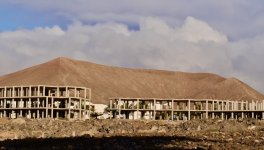
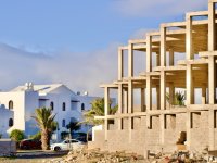
The light is certainly nicer in the 2nd one.Both nice shots, but I think 2nd one for me.
n1kcy
Special.....Extra Special
- Messages
- 2,174
- Name
- Nicky
- Edit My Images
- Yes
I think the 2nd one is winning me over tooYep me too ^^^
n1kcy
Special.....Extra Special
- Messages
- 2,174
- Name
- Nicky
- Edit My Images
- Yes
Thanks, Incomplete is actually a brilliant theme, I love the variety everyone has come up with2nd one for me too.
Good idea for theme.
n1kcy
Special.....Extra Special
- Messages
- 2,174
- Name
- Nicky
- Edit My Images
- Yes
I like number two best as well, both could do with more sheep in them imho!
n1kcy
Special.....Extra Special
- Messages
- 2,174
- Name
- Nicky
- Edit My Images
- Yes
Thank you2nd for me as well definitely. Great idea for the theme
- Messages
- 1,391
- Edit My Images
- No
Second one for me too! Works really well for the tech with the completed and incomplete.
n1kcy
Special.....Extra Special
- Messages
- 2,174
- Name
- Nicky
- Edit My Images
- Yes
Thanks I spent quite awhile trying different compositions. I liked the way the incomplete roof points at the complete houseSecond one for me too! Works really well for the tech with the completed and incomplete.
n1kcy
Special.....Extra Special
- Messages
- 2,174
- Name
- Nicky
- Edit My Images
- Yes
Spot on, gold star to you.I was thinking Spain or the Canaries. Not too far out then
Thank you, I did spend quite a while at the site trying to find the best composition.I think its unanimous - number 2 by a mile!
the repeating hollow cubes leading over and down to the finished house, lovely colours and light too. The fact it meets the theme and Juxtapostion too is icing on the cake
- Messages
- 3,302
- Name
- bill
- Edit My Images
- Yes
I think that you picked the right image Nicky, Well composed. Must admit that I had to google where Lanzarote was though...
- Messages
- 1,293
- Name
- Stuart
- Edit My Images
- Yes
Your area - they looks like you have asked them to pose and they obliged.
Incomplete - I get the juxtaposed more from the first image but the second is a better aesthetic image with nice light.
Incomplete - I get the juxtaposed more from the first image but the second is a better aesthetic image with nice light.
n1kcy
Special.....Extra Special
- Messages
- 2,174
- Name
- Nicky
- Edit My Images
- Yes
Glad I could help improve your geographyI think that you picked the right image Nicky, Well composed. Must admit that I had to google where Lanzarote was though...
Thanks, I totally agree about the Juxtaposition in the first image.Your area - they looks like you have asked them to pose and they obliged.
Incomplete - I get the juxtaposed more from the first image but the second is a better aesthetic image with nice light.
- Messages
- 3,302
- Name
- bill
- Edit My Images
- Yes
Great idea Nicky, I like the bright, offset lighting.
- Messages
- 5,928
- Name
- Peter
- Edit My Images
- Yes
Good idea and you've got the lighting just right to show that these are articial.
P.S. If you follow Cobra's instructions it means we don't have to scroll all the way through this thread to find the current weekly image. OK now but as the weeks add up it will take longer.
"Post the same image on the front page as your own thread, grab the link from the post number in your thread.
that is, right click the number top right and click copy link address.
This is all you need to add to the ( highlighted )word linky or whatever you choose, by clicking the double chain in the reply box
and insert in the top portion..."
n1kcy
Special.....Extra Special
- Messages
- 2,174
- Name
- Nicky
- Edit My Images
- Yes
Thank youVery plastic looking froooot - perfik!
ThanksLovely image.
Yep, artificial fruit and artificial light to go with it. Shooting for the theme, rather than personal tastes lol.First thought was, thats a bit bright and reflective!! Which is presumably the look you were going for, to accentuate the artificialness of the fruits.
Good job!
ThanksGreat idea Nicky, I like the bright, offset lighting.
Thanks, I've been doing lots of stuff with shadows lately, trying to learn how to control and shape them.I'm liking the shadow cast in this one. Works perfectly for the theme.
Thanks for the tip, I had no idea, I will try that this week.Good idea and you've got the lighting just right to show that these are articial.
P.S. If you follow Cobra's instructions it means we don't have to scroll all the way through this thread to find the current weekly image. OK now but as the weeks add up it will take longer.
"Post the same image on the front page as your own thread, grab the link from the post number in your thread.
that is, right click the number top right and click copy link address.
This is all you need to add to the ( highlighted )word linky or whatever you choose, by clicking the double chain in the reply box
and insert in the top portion..."
D
Deleted member 68495
Guest
Very good, just like Leebert, such a coincidence. I wrote this on his thread too 


