You are using an out of date browser. It may not display this or other websites correctly.
You should upgrade or use an alternative browser.
You should upgrade or use an alternative browser.
weekly NCF15 52 for 2024 Week 43 Rough
- Thread starter ncf15
- Start date
- Messages
- 1,150
- Name
- Alan
- Edit My Images
- No
Lots to see in this, nice. With a bright blue sky that would be dramatic but you can‘t pick the weather
- Messages
- 4,793
- Name
- Pete
- Edit My Images
- Yes
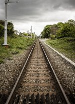
Very Straight, box well ticked on the theme.
- Messages
- 1,150
- Name
- Alan
- Edit My Images
- No
Yup, that ticks the boxes. Has a certain patina!
- Messages
- 1,305
- Edit My Images
- No
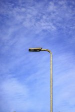
Straight and bent works really well, I don't quite know how to describe it but I like the colour palate of the straight picture.
- Messages
- 710
- Name
- Nick
- Edit My Images
- Yes
Week 20 Arches
Another Bridge. Phone photo whilst cycling so not the best quality.
 A48 Usk Bridge by Nick Dallimore, on Flickr
Couple more bridges from the same ride which weren't as arch like.
 Transporter bridge by Nick Dallimore, on Flickr
 Severn Bridge by Nick Dallimore, on Flickr
Another Bridge. Phone photo whilst cycling so not the best quality.
 A48 Usk Bridge by Nick Dallimore, on Flickr
Couple more bridges from the same ride which weren't as arch like.
 Transporter bridge by Nick Dallimore, on Flickr
 Severn Bridge by Nick Dallimore, on Flickr
- Messages
- 710
- Name
- Nick
- Edit My Images
- Yes
Week 21 Weather
Sunspots are akin to solar weather and certainly influence space 'weather' so I thought this would do. Taken with a 300mm + x2 & solar filter.
 Sunspots by Nick Dallimore, on Flickr
Sunspots are akin to solar weather and certainly influence space 'weather' so I thought this would do. Taken with a 300mm + x2 & solar filter.
 Sunspots by Nick Dallimore, on Flickr
- Messages
- 1,150
- Name
- Alan
- Edit My Images
- No
It’s a very odd image, I’m still not sure what to make of it even having come back to it a couple of times, but good for theme though and a fascinating take on it. Special type of filter?
- Messages
- 710
- Name
- Nick
- Edit My Images
- Yes
Week 22 Critters.
Choice of small, medium or larger. 2 from this mornings dog walk and the 3rd from the bird feeder. I preferred the hoverfly on the daisy rather the other 2 which although technically OK aren't anything special.
 Oxeye daisy & Hoverfly by Nick Dallimore, on Flickr
 Banded demoiselle by Nick Dallimore, on Flickr
 Blue tit by Nick Dallimore, on Flickr
Choice of small, medium or larger. 2 from this mornings dog walk and the 3rd from the bird feeder. I preferred the hoverfly on the daisy rather the other 2 which although technically OK aren't anything special.
 Oxeye daisy & Hoverfly by Nick Dallimore, on Flickr
 Banded demoiselle by Nick Dallimore, on Flickr
 Blue tit by Nick Dallimore, on Flickr


