weekly rpn's 2018 Project 52 - Week 52 SHOWCASE Added (Complete)

Hi Stan,

Lost - You would have been in trouble if you'd lost it for real.
The contrast of the pink and the blue works nicely. I do like the DoF you've used there, with the background out of focus, but this eminently recognisable.

Monstrous - Wow, that certainly shows the power of the waves. Excellent. not much more to say!

Thanks, Tim.


Two excellent shots for monstrous, good white wave against the dark grey sky.

Cheers, Chris.
 
Monstrous
That's a pretty mighty wave.
You've caught the wave just right and exposed it really well.
 
Stan

Filthy, on theme well composed but looks a bit flat to me.

Mark, again on theme, nice sky detail but lighthouse looks a bit lost, catch 22, you crop to enlarge the light house, but you lose the nice clouds.

Lost, nice idea, but the OOF is not good, cropping so only some sand and sea works better for me.

Monstrous, Thats a good image, nice load of spray against the dark sky with the harbour. entrance light just poking out. Second image shows the power of the water very well.

Pete
 
Amazing image!

I like the contrast, I especially like that little splash of colour on the lighthouse top....(is it a lighthouse?)....really draws my eye in.

Thanks, Gareth, yes it's sort of lighthouse/navigation light.


Monstrous
That's a pretty mighty wave.
You've caught the wave just right and exposed it really well.

Cheers, Dominic.
 
Stan

Filthy, on theme well composed but looks a bit flat to me.

Mark, again on theme, nice sky detail but lighthouse looks a bit lost, catch 22, you crop to enlarge the light house, but you lose the nice clouds.

Lost, nice idea, but the OOF is not good, cropping so only some sand and sea works better for me.

Monstrous, Thats a good image, nice load of spray against the dark sky with the harbour. entrance light just poking out. Second image shows the power of the water very well.

Pete

Cheers, Pete for the catchup comments.
 
Nicely done Stan, well lit, good background, and a sense of impossibility about it.
 
Eggcellent!!!

*Someone had to :)
 
Balance
That's a nice background, it's helps to isolate the eggs. Good job.
 
Nicely done Stan, well lit, good background, and a sense of impossibility about it.

Thanks, Chris. Just a pair of steady hands would do it. :)


Eggcellent!!!

*Someone had to :)

0ft6mUE.gif
 
Very nice shot for the balance theme Stan.

Thanks, Dave.


Glued? Nicely lit, good contrast against the blue/grey background.
Perhaps a bit of banding on the background though (or is it shadow?)

Cheers, Tim. Not glue but tape and other items too. I'm not sure what's going on with the background either.
 
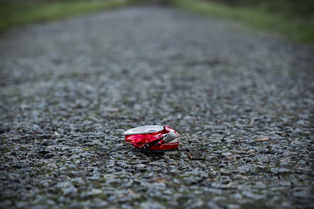
I was a bit surprised that my last week's boring eggs balancing shot got asked to join "In Explore" in Flickr and with over 40,000 views in just the first 24 hours. So this week I decided to go for another simple and boring subject again, a flattened beer can. :)

I'm two minds about the corner green patches but thought they add some interests and colours to the shot and at the same time convey the vanishing point too.


Week 49 - Crushed

Crushed by Stan, on Flickr
 
I think I prefer the second one but can't really say why, perhaps the tighter DoF. I might go for desaturating the greens a bit but I'd keep them in because I like the sense of perspective they give.
 
I like the second one too....actually, they're both pretty good, but the DoF seems more effective on No.2....nice vignetting also.

Thanks, Gareth. I set the aperture to f2.8 to ensure only the crushed can is in focus and also to isolate from its surrounding


2nd one here too (y)

Cheers, Allan.
 
Seems I'm a bit contrary then, as the 1st for me. Not sure why exactly, perhaps it's the blue of the Brew Dog can complementing the green of the grass?


Thanks, Tim. I prefer that one too and posted it in the main photo thread. I like it for the blue colour and isn't as flattened as the other.
 
That's a lovely shot for Lost, Stan, with the smooth plastic and size of the little duck contrasting strongly with the rough sea and stormy sky beyond. Lots of pleasing textures too in the water and on the sand. Glad you managed to save the duck from being washed away.
Monstrous - ah, we had the same idea a few days apart! Mine is from Storm Diana a few days later and your monster wave makes mine look like a wee splash in comparison. I do like the contrast of the white water against the dark sky, and the same in the second image.
Balance - more of your trickery! Very clever and conveys the theme in eye-catching style.
Crushed - again conveys the theme perfectly, with no explanation required. I would opt for the second one, probably because red always seems to draw the eye best and the can is more crushed than the blue one. I agree with your choice to leave the grass verges in and prefer the toned-down greens of the edited version.

A really good set of images again, and great to look at :clap:
 
My 2nd take on Motion.

Some may remember my Week 12 reshoot of Heavy. That was the foundation bases being installed and now 10 months later the offshore wind farm is fully operational and in fact, Scotland achieved over 100% power supply from wind energy alone during November.

I would prefer the blades are a more head-on angle to capture the full circle motion. However, will try again if the weather improved in the next few days.


Wind in Motion

Wind In Motion by Stan, on Flickr
 
Tow nice but very different takes on motion - and I like them both. Maybe a single one - or that group of three on the right?
 
Two good takes but as the wind turbines are a bit distant will have to say the first one it’s quite abstract but works well
 
First is a bit much for me TBH, the inclusion of the dashboard and top of the speedometer gives it some context, good idea though ;)

I agree that the wind turbines might be better if you could have got closer.
 
As others have said they're both great shots and very different.

Personally I prefer the first one....the abstract nature of the image and the vivid colours really work for me....excellent!
Also as Chris said, the dash gives a little bit of extra story.

(y)
 
Two good takes but as the wind turbines are a bit distant will have to say the first one it’s quite abstract but works well

Thanks, Allan. That was my second ever attempt at light trails from inside a car. Next time I make sure I clean the windscreen first.


First is a bit much for me TBH, the inclusion of the dashboard and top of the speedometer gives it some context, good idea though ;)

I agree that the wind turbines might be better if you could have got closer.


Cheers, Chris and yes I did manage to go back yesterday with far better weather and closer too.

Wind Trio by Stan, on Flickr
 
As others have said they're both great shots and very different.

Personally I prefer the first one....the abstract nature of the image and the vivid colours really work for me....excellent!
Also as Chris said, the dash gives a little bit of extra story.

(y)


Thanks, Gareth for the comments.
 
Those two wind trios are superb.... especially the second one, beautiful light on the waves, and that bit of cloud top right frames nicely and draws the eye in.
The extra work you put in really paid off, and as much as I like the abstract image, I think I prefer this one now!

I'm never very good at making decisions....or am I?! :D
 
Back
Top