weekly rpn's 52 Photo Challenge 2022 - Week 52 SHOWCASE and COMPLETE

Two great shots, but i prefer your chosen one for the thread.

Took a little longer to work it out which is a bonus.

Thanks, Kell. Taken from the ground floor looking up. It is a spiralling central atrium shifting in location connecting all eight storeys.

Good choice on your chosen shot Stan, it's unusual.

Pete


Thanks, Pete. A very different and contrasting geometric exterior and organic form interior.
 
Nice shots Stan, for me the second is best with the dramatic lines of the building leading to the clouds above. It would be a fun image to play around with and might make a really dramatic shot with the right b&w processing.
 
  • Like
Reactions: rpn
Great architecture !

Thanks, Alan.

Nice shots Stan, for me the second is best with the dramatic lines of the building leading to the clouds above. It would be a fun image to play around with and might make a really dramatic shot with the right b&w processing.

Cheers, Bill. I've played around with black and white processing but wasn't happy with the result. I quite like the monochrome (blueish hue) of the shot.
 
Some great shots Stan. I do like that one outside the library. With the angle, the sky and the moon it really says "looking up".
 
  • Like
Reactions: rpn
Nicely done Stan. I like both shots

Thanks, Simon.

Some great shots Stan. I do like that one outside the library. With the angle, the sky and the moon it really says "looking up".

Thanks, Peter. The library is quite an interesting building cladded with glass panels and the geometric lines.
 
I'm with you on your chosen shot but then I'm a sucker for mono!
 
  • Like
Reactions: rpn
I'm with you on your chosen shot but then I'm a sucker for mono!

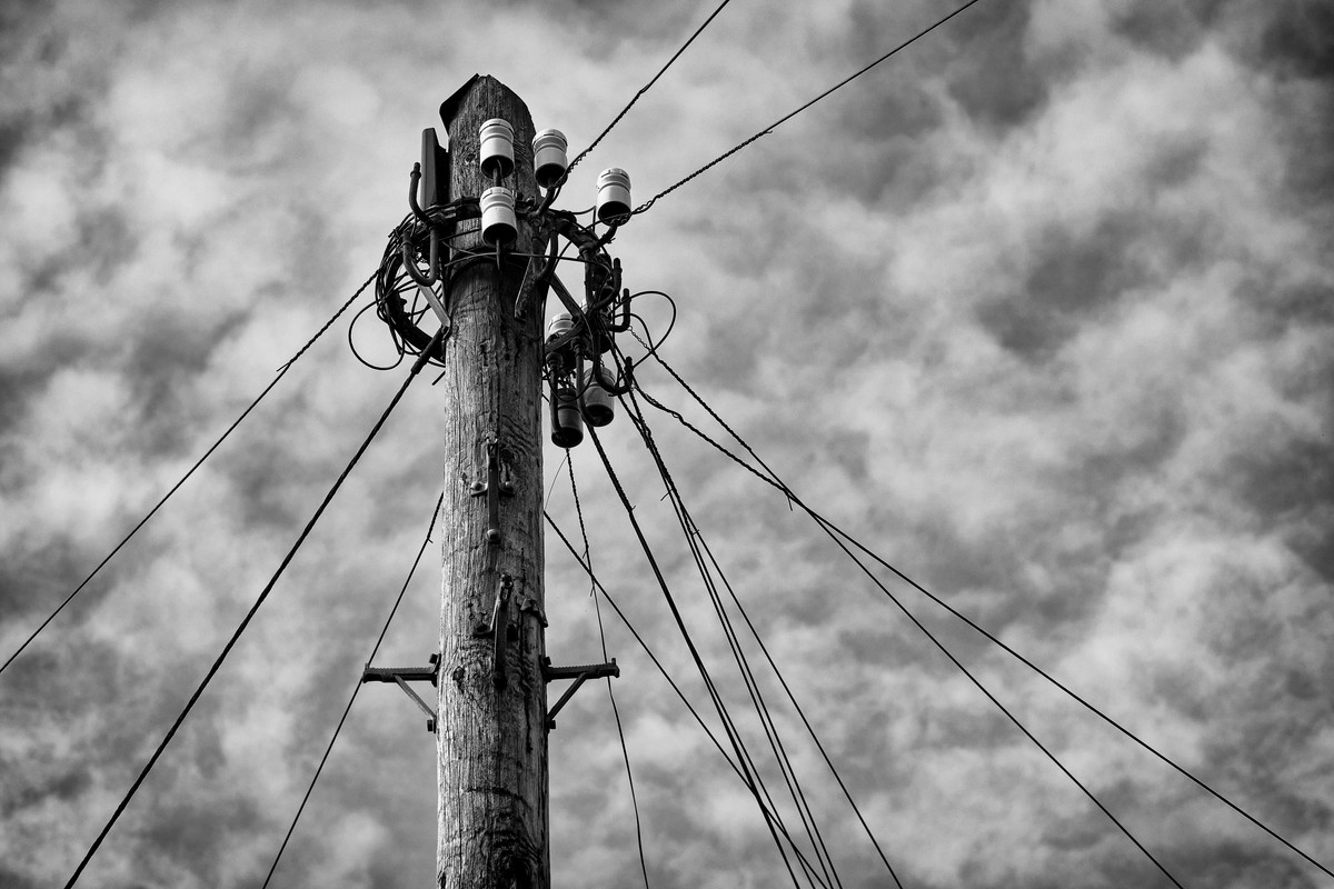
Thanks, Helen. Glad you agree with me as I wasn't too sure which one to pick. The transformer is more app for the theme but I also like how the wires fan out from top of the pole against the blue patterned sky
 
They are both very good pictures and suit the theme perfectly. Your chosen picture just edges it though as it just seems more electrical if that makes sense!
 
  • Like
Reactions: rpn
They are both very good pictures and suit the theme perfectly. Your chosen picture just edges it though as it just seems more electrical if that makes sense!

Thanks, Simon. My thought too. I decided to convert to black and white as nothing more boring than a metal box with cooling fins painted in grey.
 
The chosen image suits the conversion, although I think the alternative might have merit in B&W too.
 
  • Like
Reactions: rpn
Both good ideas and images Stan.
Personally I prefer the 2nd in mono but hey we are all different.
 
  • Like
Reactions: rpn
Both good ideas and images Stan.
Personally I prefer the 2nd in mono but hey we are all different.

Ha ha! Too many choices! I think I’m with @Peter123 and like the 2nd in mono. All fit the theme though.

Thanks Peter and Bebop. Glad you like the shot/conversion. Yes, indeed we are all different after all.
 
Looking Up:
Two lovely shots Stan. I like the first as it’s unusual and takes a bit of working out and I love the angle and colours in the second.

Electrical:
I like the first for the strong composition and mono processing.
 
Good shot for the theme Stan, and a nice link back to week 37. I quite like the other two shots as well
 
  • Like
Reactions: rpn
Good shot for the theme Stan, and a nice link back to week 37. I quite like the other two shots as well

Thanks you, Simon. A different viewpoint but fulfil the theme. I was really struggle with reflections for the other two shot. Left the polarising filter behind but managed in the end with some PP cloning brushwork.
 
Back
Top