weekly rpn's 2018 Project 52 - Week 52 SHOWCASE Added (Complete)

I spotted this piece of machinery while going fishing with friends the other day and decided to return the next day, 70 miles return trip, to capture the shot for this week's theme. It is a pulley with the winch nearby for lifting fishing boats out of water for maintenance.


Week 29 - Round

Round by Stan, on Flickr
 
Pity about that rudder in the second pic would have been a great shot of the propeller nice DoF In the first shot though to isolate the pulley
 
  • Like
Reactions: rpn
Two interesting shots there Stan. The prop is the one for me I think, I love the range of blues you've captured.
No issue with the rudder, in-fact it helps with the lighter blues and it needs to be there on a single prop boat.
Your #1 shot, while interesting, has a horrible sky. Nowt you could have done about it really I suspect and on it's own it would have been good, but beaten by #2.
 
Round
70 mile Round trip, I think that would have done for the theme in itself.
I'm a little torn between the two photos, i like old rusty mechanical things, but i also like the strong blue colour in the second photo. I'm going to call it a draw.
 
I really like the first round, good details, lots of round things and things going round
 
Hi Stan

Nice find for round - that pulley is very industrial looking. I like the details and the shine on the grease is well caught.
The round prepellor guard is also a good image, nice bright blues, just a shame the rudder is not straight on.

Pete
 
Apologise, again, for lack of commenting this week. Never thought having two grand-daughters staying with us would've kept me busy and running about all week. Doesn't help that at the same time we are getting packed and organised for our two weeks Far East trip to Hong Kong and South Korea.


Our evening dinners a couple of days ago. Yes, the knife is blown.

Week 30 - Cooking

Cook by Stan, on Flickr
 
Yum, yes please. Like the compo pity about the knife getting blown but the fact it is in there makes the picture more on theme. As said above colours are really good.
 
Hi Stan.
Is the lobster to get you ready for eating in Hong Kong?
I like the use of diagonals, no problem with the knife, it adds context. The grey carpet though, for me it doesn't work.
 
Cooking

It looks good to me, I like the composition and the knife.
 
The knife is a bit marmite, in and not blown or leave it out, I think either would work but probably having it in adds a bit more context for the theme
 
Hi Stan,

Short (#1) - Interesting close up short of some Daisy's, I thought it perhaps needed Daisy in them, but then you wouldn't get to do the close up, so actually, this is the shot of the two I think.

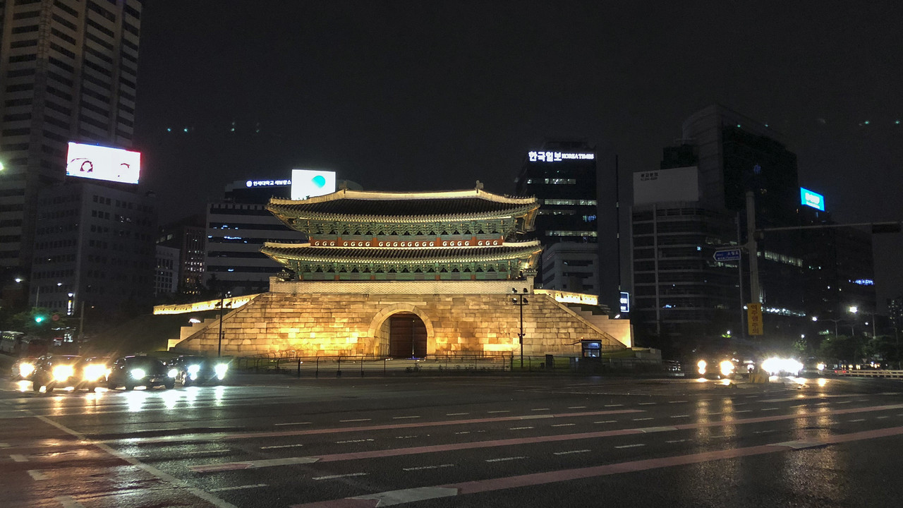
Forked - The main subject is nicely captured, a bit of a shame that the neon billboards are so blown.
Not a shot you could do with HDR, with the movement, so I wonder if graduated filters in LR/PS could recover the blown boards (or are they just too far gone?).


Thanks, Tim for the comments. As said they are just PABD or 'Lick The Stamp And Send It' snapshots to fulfil the weeks.
 
As you say above they are not up to your usual standards, they do fit the theme though
 
Short, I like this although for some reason it reminds me of Father Ted and his priest in a lingerie department, photographer in a clothes store!

Fork, again I like the shot, fits the theme and good on you for bothering when on holiday.
 
Hi Stan

Cook, or intention to cook, nice details in the lobster, exposure spot on apart from knife which you have mentioned, I like the layout of the chopping board and lobster but I'm not sure about where the knife is placed or where I would place it either, maybe not include it or a different knife? It's a nice simple image.

Short 1 - They look short, background left hand side maybe could have been moved out of th way. I take it there are other shorts behind.

Short 2 - I like this better, to me the image tells a story, dont mind the stuff in the background as its part of it.

Forked - On theme, but It's difficult to see where the road forks, but I know it does because that building is in the way. I guess you where in a coach from the light reflections across the image. You did well to capture it.

Pete
 
Thanks, everyone for comments and, again, apologise for the lack of from me.

Home now after my holiday in the Far East. I found the 35C heat just unbearable day after day mid-teens here is more comfortable for me. Took me a few days for my body clock to adjust, have been getting up wide awake at 3 in the morning and knackered by 7 in the evening.

Went out over the weekend and managed to capture these for this week's theme.


Week 33 - Refuse

Refuse by Stan, on Flickr
 
Two good shots there either work for me it’s hard to choose but if I had to maybe the second one for the symmetry
 
Both shots are bang on theme, well composed and good exposure, lets be honest making an interesting picture out of bins is always going to be very hard, but the use you have made of colour and symmetry shows what can be done.
 
Hi Stan

I Like the first image for the extra colour, while the cropping on the second one is better. Very Tidy Refuse tips you have there.
 
Nice shot for refuse Stan, I like the colours of the different bins. I like how you've cropped the second shot but for me the colours make the first one my favourite
 
Refuse
#1 has a lot more going for it, bright and colourful, good composition. Not something you usually associate with rubbish.
 
The first of the 2 shots for me Stan. Whilst not quite symmetrical, there is nothing you could do about that short of nicking a dumper truck to move one ;) and the sky, whilst grey, does have mood to it, whereas in #2 it's just white / blown.
I also prefer the complementary red and green hues to the grey bins in #2.

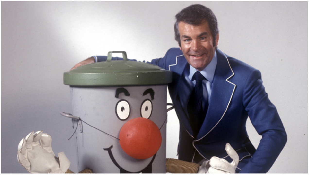
The Dusty Bin image is interesting. I'd not noticed before that the producers had used complementary colours on Dusty himself.
 
Second for me, nothing wrong with either really but TBH I wonder if you could have done more, close up, different angle, etc. I realise it wasn't the most inspirational theme.
 
Back
Top