weekly rpn's 52 Photo Challenge 2022 - Week 52 SHOWCASE and COMPLETE

No1 is the one for me, although I must admit i'm not fond of motion blur or ICM (I'm just an old fashioned bloke :D:D). The colours are lovely and the tech is spot on too.

Cheers, Jim. The motion blur effect has its own place but may be not for this image.
 
Love both of these Stan! I always like that combination/juxtaposition between the movement of the ICM and a static image.
 
  • Like
Reactions: rpn
Similarly I’m not keen on ICM or motion blur but it works well in this shot, I quite like it
 
  • Like
Reactions: rpn
Love both of these Stan! I always like that combination/juxtaposition between the movement of the ICM and a static image.

Similarly I’m not keen on ICM or motion blur but it works well in this shot, I quite like it

Thank you, Bill and Alan. Indeed the ICM/motion blur effect is not to everyone's taste but we are different after all? (y)
 
A nice creative take on the theme and tech :woot:
 
  • Like
Reactions: rpn
I prefer the 1st shot and the blur adds something to that image. Nice colours and fits the theme and tech.

Pete
 
  • Like
Reactions: rpn
No 1 for me. The blur fits the image very well. I'm goint to have a play with this technique.
 
  • Like
Reactions: rpn
I prefer the 1st shot and the blur adds something to that image. Nice colours and fits the theme and tech.

Pete

Thanks, Pete.


No 1 for me. The blur fits the image very well. I'm goint to have a play with this technique.

Thanks, Donal. The motion blur is quite a simple process. Give it a go and would love to see your effect.
 
Autumn - I prefer number 2.

I'm struggling to work out what the motion blur adds to the first image - other than to really hammer home the tech.

But in the second one, I think it gives a real sense of uneasiness or trepidation to the shot. Like the static equivalent of a snoricam shot. It's really quite disorienting.

Vehicle - I like the fact that you've done something very different with the shot, rather than just taking a shot a of a car.

Precision - I really like the watch image for the colours, but prefer the needle for the interpretation of the theme. Especially as in the last couple of years I definitely relate to how quickly your eyes go and I can't do that any more.
 
Interesting shot Stan. The colour one would be my preference. Would be interesting to see a wider shot (another shot, not a wider shot of this frame) for context.
 
  • Like
Reactions: rpn
Great eye Stan, I do like the black and white image the best.
 
Great image Stan, Prefer the colour one.

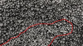
I think if all the logs were like the dryer ones (if they were drier that is, I mean the section outlined below), the B&W would have more punch, but because they mostly have that brownish tinge, it's all converted to too much grey for me.

52497086513_c70edcd5ce_b copy.jpg
 
Last edited:
Fab shots - I’m a big mono fan but in this case the colour does it!
 
I really like #1 of autumnal - it works perfectly. The second shot seems to send my eyes a little wonky, but that may just be my eyesight!
 
Definitely the colour shot for snappers choice... it's a striking image.
 
Previous week! : I like both shots and I think both would work without the blur too. I'm on the fence about the half and half :D

Snappers choice - colour for me - really like it!
 
Last edited:
Great capture Stan, makes me wonder how far from the water it was originally. The wind must have flung it pretty far.
 
  • Like
Reactions: rpn
Great capture Stan, makes me wonder how far from the water it was originally. The wind must have flung it pretty far.

Thanks, Bill. Likely to be just carried down the rivers. River Dee at the south end of the beach and River Don at the north with both rivers originated up in the Cairngorms mountains.


You've captured some nice light on the tree. Good shot.

Thanks, Helen.
 
Scotlands National Animal - nice one :)
 
  • Like
Reactions: rpn
Nicw perspective and the lighting works very well. Great for the theme too.
 
  • Like
Reactions: rpn
Back
Top