- Messages
- 4,562
- Name
- Mark Gameson
- Edit My Images
- Yes
Really like the Ruth nice fun take lovely use of DoF.

Really like the Ruth nice fun take lovely use of DoF.
")
I like the way the pawn hides the blue tack ... only joking.
It's good to see more eggy fun, you're good at this.
Love what you do with an egg Ruth ! Very novel ideas !
Good use of colour, good use of DoF, carefully constructed props (crown), what's not to like.
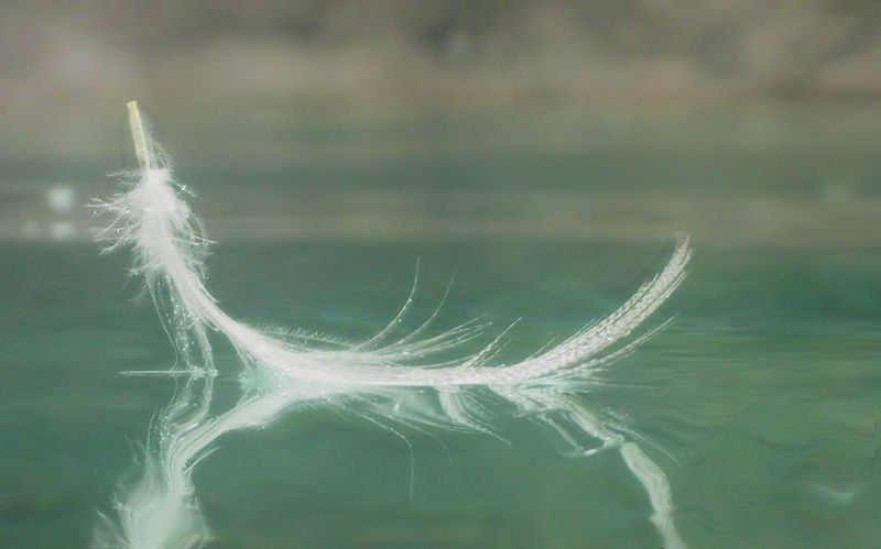
A Feather Boater
We wouldn't know it was a tray of water if you hadn't old us. Nicely done.
Thanks Susie.Good idea Ruth, I think it would take a nip off the top, excellent choice of colour it emphasises the Serene look
- Anyway, very effective you would never guess it was in a tray Works well Ruth, you have mentioned the bottom so wont, well I guess I have
Great idea and very pretty colours -it has a very nice dreamy feel.
Wot no eggs?
Simple but effective Ruth
Touche'Well, it came from an egg originally.
Thank you Carl.... It's definitely not the shot I planned.Very well conceived and constructed Ruth. The top left of the feather looks almost frost-like to me.


According to a Paul McCartney & Stevie Wonder thats actually Ebony and Ivory
Nice simple interpretation Ruth
See what you mean about the first shot it doesn't look like a photo, I do like that very clean keyboard though
Good thinking Ruth. First shot is interesting but like your second shot best mainly because of the lines and angles created by that slightly off kilter take.
Two smashersRuth
Keyboard's a great idea, quirky angle
But is it just me ... Blown highlights?
Hi, 1st one...is it a photograph??
Nice angle in #2 and detail.
Cheers.
Very nice Ruth, I agree the first does have the look of graphics rather than a photo, but that's cleverly done.
I like the piano, but actually I prefer #1
), unusual angle adds a nice dimension too, like it Hmmmm liking both of them Ruth, agree that the text image at first glance does not look like a photo, although it is very effective... The piano image works really well (ignoring the lh crop and dust spot

I've had a close look, and there's nothing blown on the full res image.
Always appreciate your crit though David, good or bad.
Thank you.
But there's no such thing as bad crit surely.
You're right.
Positive or negative?
I'm being a tad fussy aint iThanks for your comment Dean.
The dust definitely needs dealing with.
Yeah that is just me, seeing that tiny smidgen of white key bottom left, my OCD would want that 2mm cropped offThe crop? Each to their own
I'm being a tad fussy aint i
Yeah that is just me, seeing that tiny smidgen of white key bottom left, my OCD would want that 2mm cropped off
1st one is a good idea but like you say it doesn't look like a photo....your writing is obviously too neat, you would never mistake my scrawling for type
Liking the nice reflective whites on the keyboard and the choice of angle.